Freelancer: viditkothari
Dela:
Rapportera post

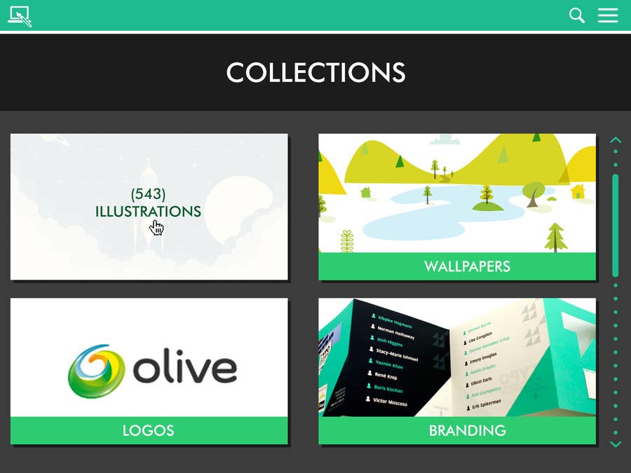
Flat, clutter free & luring Mockup

The concept which you drafted and the briefing seemed liked this project needed a real UI and am so sure that this will make client happy. I've made this UI with such precision. The use of optimum no. of colors, fonts. I've added the comment section in the Zoomed section so that each image has a thread in case it needs discussion. I've tried to make the prize amount worth every single penny. Looking forward to reply.
Tävlingsbidrag #6 för                                                 App Mockup for a Graphic Design Showcase

Klargörandetavla

  • viditkothari
    viditkothari
    • 8 år sedan

    About the Illustrations page, please consider the process flow I've implemented
    Its:
    Home screen (i.e. Collections) >> Specific Category Screen (i.e. Illustrations) >> Zoom/Larger View (i.e. # Scenery Page)

    Then there is a favorites' screen where a user can see all the starred items collectively as in your sample mockup

    Please let me know if this is the process you are following as well

    • 8 år sedan
  • viditkothari
    viditkothari
    • 8 år sedan

    What is the different views for?
    Alternate variations of the designs or other similar kind of designs?

    • 8 år sedan
  • viditkothari
    viditkothari
    • 8 år sedan

    What I'm thinking to do to improve:
    1) Keep in mind larger displays (and am very definite that flat-style is the way to go)
    2) "Remove" the unnecessary Black Title Area

    • 8 år sedan
  • peterhamilton
    Tävlingsinnehavare
    • 8 år sedan

    1) Agree
    2) iPad is fine, actually more interested in the TV view.
    3) Navigation is fine, title bar is unnecessary
    4) I'd be interested to see them
    5) Got it.

    • 8 år sedan
  • peterhamilton
    Tävlingsinnehavare
    • 8 år sedan

    Apologies, I didn't mean the navigation bar, I meant the "title" section - "Collections", "Illustrations" etc.

    By tiling, I wasn't referring to the main "browse collections" page, I meant the "Illustrations" page.

    • 8 år sedan
  • viditkothari
    viditkothari
    • 8 år sedan

    And I just happened to analyse the other 4 star design and its got (almost 90%) same sized menu bar. and that design is also tiling just with a different spacing and padding

    • 8 år sedan
  • viditkothari
    viditkothari
    • 8 år sedan

    1) Tiling will work best, as it will adjust according to the display's dimension smoothly
    2) This design was made according to the latest iPad but can be easily re-adjusted to any other popular tablet.
    3) The title bar is just 100 px, I can get it to 60, lowering which will be bad for UX
    4) I'll add the features ('Alternative Views' I think) in the preview section.
    5) On TV screen the tiles will rearrange to become more rows and 3-4 columns

    • 8 år sedan
  • peterhamilton
    Tävlingsinnehavare
    • 8 år sedan

    Appreciate the different views. The tiling probably doesn't work so well as the designs would all clash (maybe?). The title bar takes up a little it too much room for me and the preview page is missing a few features I gave examples of in the mockups

    • 8 år sedan
  • peterhamilton
    Tävlingsinnehavare
    • 8 år sedan

    Not sure this would look great on a big flatscreen TV? Some interesting approaches though.

    • 8 år sedan

Visa fler kommentarer Bearbetar ...