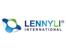
Logo Design for Lenny Li International www.lennyli.com
- Status: Closed
- Pris: $290
- Bidrag mottagna: 2
- Vinnare: astica

Tävlingssammandrag
Lenny Li provides IT services from his heart with integrity to serve worldwide customers, help his trademarked name and warm shine through with his 15 years experience plus multi vendor industry certifications!
Rekommenderade kompetenser
Arbetsgivares feedback
“Able to demonstrate true creativity and technical skills to suit client's needs”
![]() lennyli, Hong Kong.
lennyli, Hong Kong.
Klargörandetavla
-
BestCoder01
- 12 år sedan
Please give a look at #250 #251
- 12 år sedan
-

curlewgraphics
- 12 år sedan
I submitted my design for your review in different layouts and effect changes. #229 #230 #232 #233 #235 . Please let me know if you like the design but would like to see some changes.
Thank You!- 12 år sedan
-

danjuh25
- 12 år sedan
hi sir..submitted new design..draft #228 and #231...thanks!
- 12 år sedan
-
danjuh25
- 12 år sedan
oh...i'm sorry i didn't notice...because its on the second page..
- 12 år sedan
-

oleoleku
- 12 år sedan
danjuh25: same logo with mine??
- 12 år sedan
-

romeopondal
- 12 år sedan
My Best design Simple and Clear.. #207
- 12 år sedan
-
danjuh25
- 12 år sedan
hi!i've submitted an original but hitech design for you..draft #205..hope you like it..thanks!
- 12 år sedan
-

Tävlingsinnehavare - 12 år sedan
karunaus: Would you be able to explain how #184 is a significant improvement over existing trademarked logo that deserve a design cost of USD290 plus global legal and admin fees at over USD10000 level?
- 12 år sedan
-

karunaus
- 12 år sedan
Please provide feedback on #184.
- 12 år sedan
-

jeffaquino
- 12 år sedan
I just submitted two logos (#168 and #169) with same concepts and different layouts. I would really appreciate to hear your feedback. Thank you.
- 12 år sedan
-
Tävlingsinnehavare - 12 år sedan
For #90, if the icon gets rotated more clockwise so the blue L corner gives people a better impression to identify with "L", rather than a shape, may be more meaningful
- 12 år sedan
-
Tävlingsinnehavare - 12 år sedan
It would be good if #51 offers more customised feel instead of having a generic ball with 1/0s that makes it looks like an off the shelve sample.
- 12 år sedan
-
Tävlingsinnehavare - 12 år sedan
#102 is pure creative playing with character shapes. It does not convey nature of what I represent
- 12 år sedan
-

Freelanceatwork
- 12 år sedan
why cant i submit my design
- 12 år sedan
-

AlexForascu
- 12 år sedan
Please provide feedback regarding #102
- 12 år sedan
-
Tävlingsinnehavare - 12 år sedan
103 is good try but has no special character, any name can be placed on top of a circuit chip, and i am not a chip manufacturer, the colouring is very dark and difficult to make the name standout.
- 12 år sedan
-
Tävlingsinnehavare - 12 år sedan
67 is good in that it is a creative play with the character Li. However it is very 2D and leaves little to further imagination. Colouring is also not very refined or sophisticated.
- 12 år sedan
-
Tävlingsinnehavare - 12 år sedan
89 and 90 are both excellent, because it utilise the original registered mark with a small gradient variation so it may cost less financial to utilise. As for the graphic icon, 90 is more 3D and lively while 89 is more tidy and neatly placed, but too rigid and boring. 89 resembles the shape of Li , while 90 seems to look like the outline of a lifesaving inflatable circle tube float, meaningful for my support services.
- 12 år sedan
-
Tävlingsinnehavare - 12 år sedan
For 117, remove the .com from the text as that is not part of the registered trademark name. Also if you use the graphic icon there, you'd better skew it to make it look more meaningful, such as resembling the shape of L, etc.
- 12 år sedan
-

BeNZeN
- 12 år sedan
Please, could you give me some feedback about #117?
- 12 år sedan
-
Tävlingsinnehavare - 12 år sedan
To enter contest, sign up a free account at http://www.freelancer.com/friend-invitation/join.php?id=3157667 first!
- 12 år sedan
-

lemuriadesign
- 12 år sedan
feedback please?
- 12 år sedan
-
Tävlingsinnehavare - 12 år sedan
Some contents of www.lennyli.com updated, see if you can get more clues about LENNYLI there.
- 12 år sedan
-

honestman1
- 12 år sedan
what can i do?
- 12 år sedan
-
honestman1
- 12 år sedan
i created a 3d logo but i can't upload . when i am uploading my logo this message has been shown " You have been excluded from contests" ?
- 12 år sedan
-

BeautyOfCode
- 12 år sedan
Ah... I will modify my design
- 12 år sedan
-
Tävlingsinnehavare - 12 år sedan
Note: trademark regulations forced us not to have space between LENNY and LI, and therefore your design need to avoid having 2 seperate words.
- 12 år sedan
-
Tävlingsinnehavare - 12 år sedan
TV commercial shows a sea of computer icons/buttons/errors/commands. See if this helps your assembly of Logo idea
- 12 år sedan
-
Tävlingsinnehavare - 12 år sedan
It is 10 year anniversary for LENNYLI INTERNATIONAL soon, He wishes everyone a merry computer session!
- 12 år sedan
-

ayazgul
- 12 år sedan
how can i enter in contest and upload logos?
- 12 år sedan
-
Tävlingsinnehavare - 12 år sedan
Existing HK's registered trademark can be found via http://ipsearch.ipd.gov.hk for LENNYLI
- 12 år sedan
-
Tävlingsinnehavare - 12 år sedan
An example theme relates to the concept of having a billion computer font types with commands, error messages, or millions of buttons and icons bursting from somewhere... or something blurbbed out from a huge network. Or the idea of showing the text LENNYLI using the windows command prompt Raster fonts with some flashing cursor at end (where the tiny TM mark is overcasted)...
- 12 år sedan
-
Tävlingsinnehavare - 12 år sedan
For facebook photos or career history, you may refer to www.facebook.com/lennyli or http://www.linkedin.com/profile/view?id=28921793&trk=tab_pro . Also, a jingle or slogan is made up along the lines 'Lenny Li means Troublefree IT'. Therefore, a sample logo may be having a thin silver bar with the word 'International' underneath LENNYLI, which may rotate 3D to show the slogan 'Troublefree IT'. LENNYLI is certified by multiple places such as Microsoft, IBM etc. His background blends the best of East and West.
- 12 år sedan
-
Tävlingsinnehavare - 12 år sedan
The existing trademark is registered worldwide under slight variations. You may see an official entry for Taiwan at http://tmsearch.tipo.gov.tw/TIPO_DRE/servlet/InitLogoPictureWordDetail?sKeyNO=097052116
You can post your techno themed or 3D enabled design by opening account here on freelancer to get your chance to win US$290. I have another logo contest running too, checkout http://www.freelancer.com/contest/Logo-Design-for-Department-of-Health-Radiation-Health-Unit-HK-30.html- 12 år sedan
-

sunitaggc69
- 12 år sedan
how to post the design
- 12 år sedan
-
Tävlingsinnehavare - 12 år sedan
I think from legal point of view, my registered mark is LENNYLI (no space), as such, I guess the logo cannot use space, but perhaps 2 slightly different colours for the 2 words?
- 12 år sedan
-
Tävlingsinnehavare - 12 år sedan
Pls incorporate a description or imagination of how the logo will animate/move on a TV advertisement.
- 12 år sedan
-

nethelper
- 12 år sedan
i can do any thing that you think its good for your logo
- 12 år sedan
-

afreenroshan
- 12 år sedan
hey I am ready
- 12 år sedan
-
Tävlingsinnehavare - 12 år sedan
Let's celebrate Lenny Li's 38th birthday on 9June! Happy computing everyone!
- 12 år sedan
-
Tävlingsinnehavare - 12 år sedan
The original logo was just an arial font LENNYLI registered in trademark. Later the graphic part with some circle dots were added and became new tm registrations. Either a complete change, or partial change to stand out, as perhaps the Arial LENNYLI text may be a little ordinary? (Nothing wrong about that)
- 12 år sedan
Hur du kommer igång med tävlingar
-

Lägg upp din tävling Snabbt och enkelt
-

Få massvis med bidrag Från världens alla hörn
-

Utse det bästa bidraget Ladda ner filerna - enkelt!