drevchuk94
Ukraine

Task summary: Create brand logo, favicon and header image for new blog
Detailed explanation:
I'm starting a wordpress blog named "Hope I Helped You" (http://hopeihelpedyou.com). Update 2019-06-16: I recently renamed this to "Hope I Help You" so please consider this name and not the first.
It's empty at the moment and before I start writing posts I'd like to create a visual brand for the name. As you can see from the website, it's all very bland now. The blog title text "Hope I Helped You" is written with an uninteresting font style, and I got a header banner from Pexels which I think can be replaced/improved. I tried creating a favicon for the website but to no avail. I need help.
Note that the blog subtitle "Tips on effective communication, people management and information technology" shouldn't be part of the logo design since I'll change that text over time.
Listed below is what I think needs to be created. However, since I'm new to the blogosphere and social networks I'll consider your suggestions as well.
Deliverables I think I need:
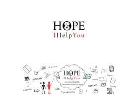
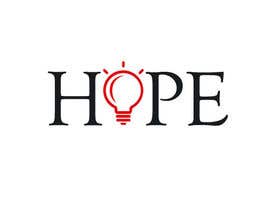
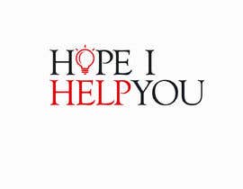
1- Blog name logo
- with the text: Hope I Helped You
- I think it should have up to 320 pixels of width and between 40 to 120 pixels of height (or be resizeable in that proportion)
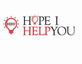
2- Favicon
- probably best to include the initials HIHY or hihy or HoIHeY?. I'm thinking something that could be used as the short name or "stamp" that people recognized and associated with the main brand name. It can be a circle, square with rounded corners, or a logo with a transparent background, not sure what the best choice would be but something easily recognized as an icon on the web browser or as a link icon on Android/iOS.
- image size 512 by 512 pixels
3- Header Image
- I like the image I have now from Pexels (Janko) although it doesn't feel personalized to the brand. What I like about my current image is the representation of the amount of knowledge in books and the illuminated path (brings to mind the concept of bright ideas). Also the spider webs represent old but wise knowledge.
- the image I use currently is about 2000 by 600 pixels (which then gets resized when shown in the website)
Here are some keywords that define the blog and could be used as inspiration for the images: productivity, deep thinking, reading books, focus flow, helping others, personal development, personal achievement, information technology, management tips, effective communication tips.
For the deliverables I have the following requirements:
- Transfer legal rights of ownership (so I can use the images without copyright infringement)
- Source file
- Logo with transparent background
- High resolution
- Vector file (so I can rescale it)
The writing style of the blog will be semi-formal. I'm aiming for a professional tone with some complexity but with the occasional uplifting and encouraging expressions.
Let me leave you with a couple of logo examples that I liked:
- https://fs.blog/
- https://www.thecreativepenn.com/
I hope to have explained the project in enough detail.
Hope to hear from you soon.
Kind Regards,
Ruben Gomes
“Dmytro delivered very creative ideas that represented exactly the message I wanted to show in my brand. ”
![]() iRubenGomes, Portugal.
iRubenGomes, Portugal.

Lägg upp din tävling Snabbt och enkelt

Få massvis med bidrag Från världens alla hörn

Utse det bästa bidraget Ladda ner filerna - enkelt!
