Garibaldi17
Peru

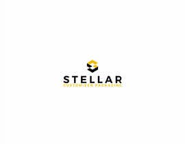
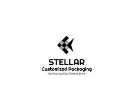
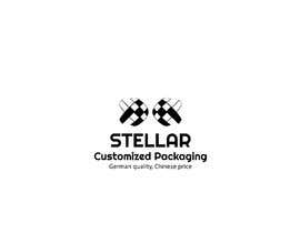
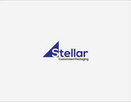
A great business needs you to design a great logo
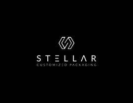
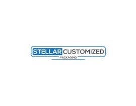
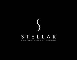
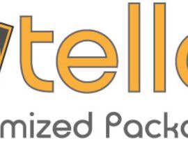
The logo needs to be minimal and the typeface has to be bigger than the logo/illustration, as for the logo it needs to be minimal, I've added many examples as attachments, check them. The name of the business is ''Stellar Customized Packaging'', but the most important word in the logo is actually just ''Stellar'', check ''NEFAB'' attachment to see what I mean. It's a b2b service that offers packaging solutions to other businesses, because of that, the logo must convey a feeling of the following keywords, CUTTING EDGE, STATE OF THE ART, HIGH QUALITY, NEAT, NICELY DONE and the following are optional but if you wish to experiment with what they stand for then go ahead, INDUSTRIAL, Factory , MODERN. Let's take one of the logos and dissect it and show you what I like about it.
If you check Zenith logo, The illustration is great because it's simple and small and it merges with the typeface/Font(you may choose to do that or not), it's also pointy. Remember it needs to be simple, minimalist and clean. You can go creative if you're confident you'll come up with something great but don't violate the general guidelines I've stated. As for the color of the logo, you may choose to do a single color or 2 colors maximum, or the colors in the examples I've attached are good, for example 1.Black and yellow, or 2.blue or 3.Gray and yellow and black I know it exceeds the number of colors I've allowed as a rule but if you can pull this off it will look good.
- If you have absolutely no idea on how to go about this, here's an idea but you don't have to follow it. Make the colors black, yellow and gray. Stellar is going to be the main word and the first letter(S) is going to be the same as ''ZENITH'' logo(Check below) but instead of a pointy triangle, do something like the ''Madeinasialines.png'' in terms of the parallel 5 lines, but 5 lines are too much and there is too much space in between the lines so try to fix that if you want to go with the way I'm describing, you're free to experiment with that, one line over ''S'' of Stellar could work perfectly if you know how to do it. Otherwise let your creativity be unleashed just don't overstep the boundries I've set.
The guidelines that are not to be violated are:
- Simple/Minimalist
- 20% illustration 80% Typeface
- The name of the business is '' Stellar Customized Packaging''
- Must convey a feeling of being Modern, High end, Cutting edge, High Quality.
“@Garibaldi17 won the contest on 26 June 2018”
![]() briefing, China.
briefing, China.

Lägg upp din tävling Snabbt och enkelt

Få massvis med bidrag Från världens alla hörn

Utse det bästa bidraget Ladda ner filerna - enkelt!