alamin421
Bangladesh

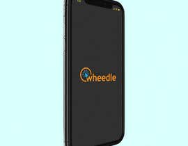
***UPDATE: See attached suggested logo. Would like something along these lines of a circle around the 'w' and with an CLICK icon maybe clicking on the circle around the W. This is just a suggestion of where I think this idea is going. Please duplicate with your own perspective. The name should be all in lower case (unless you have a better idea) and there should be some element of colour. ****
Hi. I'm looking to have a logo created for a new online application called WHEEDLE.
The system is a new way of managing field workforce and administration. It is a end to end automated Field Workforce Management Solution specialising in SHORT-TERM, HIGH-VOLUME field work requiring QUICK TURN-AROUND to ensure regular customer payments. It is essentially a business management system that will change the way some small businesses are working.
Wheedle means to obtain through artful persuasion. The idea behind this system being called wheedle is that it will help the user 'wheedle everything they are owed from the people they work for'.
Wheedle tracks your work and ensures you are paid for what you have done. It tracks, reminds, chases and confirms all work and payments. Provides visibility to your clients, customers and workforce.
I'm looking for a simple, clean, crisp logo and colour scheme that can be used across all branding including the platform, marketing and social media etc. I will also need to winning entry supplied in various media formats. The successful contestant may have the opportunity to further work with us on the future company branding such as business cards, banners etc.
Let me know if you have any questions. Thanks.
“Very responsive and provides good quality work.”
![]() OBSS, Australia.
OBSS, Australia.

Lägg upp din tävling Snabbt och enkelt

Få massvis med bidrag Från världens alla hörn

Utse det bästa bidraget Ladda ner filerna - enkelt!