Bootstrap design
- Status: Closed
- Pris: $400
- Bidrag mottagna: 8
- Vinnare: bahrul221

Tävlingssammandrag
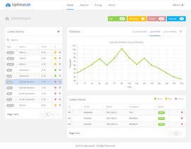
I have a design from another freelancer I want to convert from drawings to responsive bootstrap. The designs 4 pages is attached, I have also included the image of the mobile version of it. Please look mostly at design.jpg, as it has sligthly more correct colors on icons. By using responsive bootstrap v3, mobile should be supported.
This task is mainly to convert the drawing into 4 bootstrap-html pages with example data.
The header and footer of the page, along with the left sensor-list, should be the same on all pages. Use standard bootstrap code.
IMPORTANT: In two out of maybe 30 projects I have done here this year, the coder has made a bootstrap design in css that is not responsive and hard-coded positions using css instead of using the advantages that responsive bootstrap gives. It kind of works, but it's a nigthmare to maintain. An example of what bootstrap I like, see stemfrem.no for instance. Simple, clean.
Contest rules:
- Post any improvements you would suggest. Note that I'm 90% happy with the current design. I could probably live with it like it is.
- Mention any suggestion or advantages you have on doing this project.
- If you implement a live example of one page I can see, for instance a datatable with refresh, it will be a big advantage so that I know you can do it.
- Improvements in logo is welcome.
If you are awarded, you must follow these rules:
- Deliver ready response bootstrap using datatables in both the left column sensor list and in latest values. 4 pages as attached. Before the handover-limit.
- You can use example data to show that filtering (search) is working in the left sensor list. I prefer if you can use backend-ajax to update it at given intervalls. This can be call to a backend-PHP file (you can use example data in a php-file).
- Implement the main graph so that I can easly update the values. Please note that I don't know javascript/jquery, only html/php, so it must be easy implementable. The graph measures load time in ms and something it will be "0" if the ping/website doesn't respond. I was originally thinking google graph since I have found it easy to user, but the designer suggest the one shown in image.
- Icons should be from font-awesome pack in bootstrap.
- The list of sensors should have a label/badge to the left (of equal width) and the name of the sensor should be clickable (link).
- Same header/fotoer/left sensorlist should be present on all pages. So that should ease the graphics -> html-part.
Rekommenderade kompetenser
Arbetsgivares feedback
“Did an amazing job on my bootstrap contest. Highly reccomended!”
![]() DeltaUser, Norway.
DeltaUser, Norway.
Klargörandetavla
Hur du kommer igång med tävlingar
-

Lägg upp din tävling Snabbt och enkelt
-

Få massvis med bidrag Från världens alla hörn
-

Utse det bästa bidraget Ladda ner filerna - enkelt!